Flyer Design Tips:
Make Activity Flyers That Get Noticed
A practical guide to designing flyers that get noticed, get read, and get results.
by Celest Chase, AC-BC, ADC, CDP, CMDPD
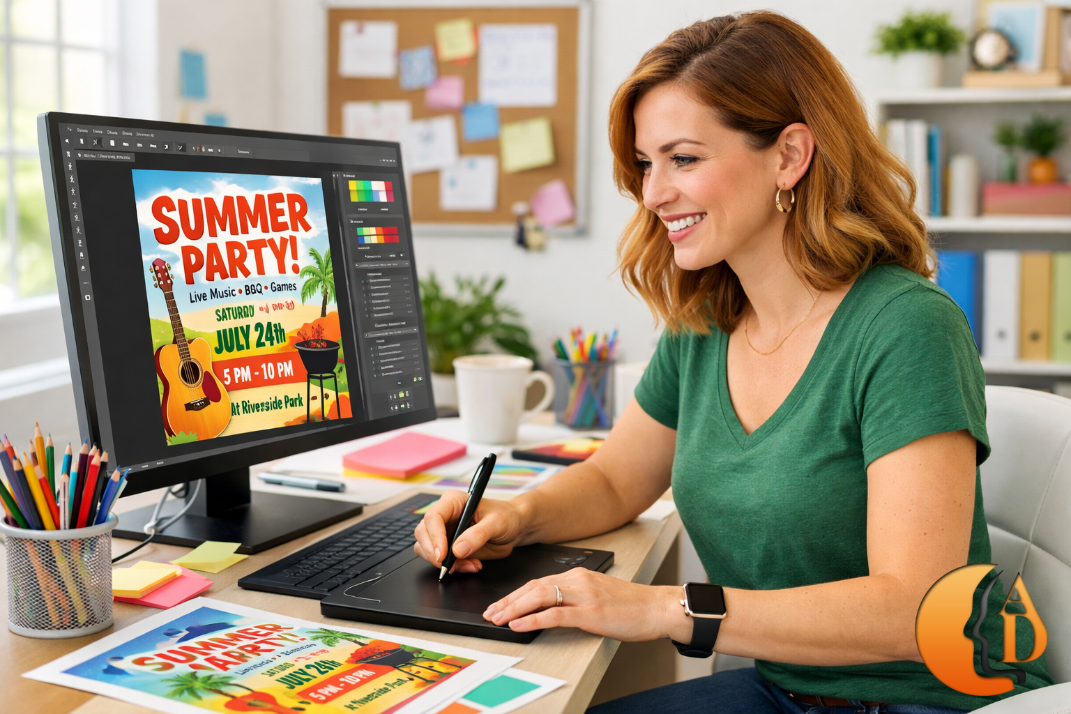
Consider a flyer as a blank canvas where you can explore your creative abilities while getting the word out about your upcoming event. Flyers are read, passed along, reproduced, posted on bulletin boards, mailed, or sent electronically — multiplying your reach and boosting the odds of connecting with the right audience. Flyers can vary in themes from advertisements, announcements, invitations, updates, and welcome notices. They can also promote musical events, fundraisers, craft shows, and any other evet that sparks public interest. So what characterizes an effective flyer?
Ingredients of a Good Design
If you’re new to the design process, it can be tough figuring out what kinds of choices work together to create an attractive yet effective final product. Why do certain fonts go together? How does a strong color scheme come into play?
Here are some basic qualities you’ll want to get right on your flyer:
- Eye-Catching: If it does not have visual interest, no one will be persuaded to investigate what the flyer contains.
- Clear Focal Point: The part of the layout that draws viewers into the design and into its message. It might be an image or graphic, a headline or promotion, or other text/lettering — but it’s usually the thing people notice first.
HINT: Make sure your focal point directs viewers to the most important information you have to communicate.
- Relevant Imagery: Shapes or icons, a background photo, a custom illustration, or hand-drawn typography.
HINT: A visual component that is relevant to the purpose or theme helps people “get it” before reading the fine print.
- Appropriate Fonts: Typography sets the mood and “feel” of a flyer. Choose typefaces that match the audience and the intent, and keep things easy to read from a distance.
Color Considerations
We are visual creatures and nothing attracts attention quite like a splash of color. Colors engage feelings and create impact. Warm colors like red and orange often communicate warmth, energy, and excitement, while cool colors like blue and green are more calming, nature-inspired, and conservative. Use these qualities to enhance your flyer’s message.
HINT: Colors can strongly influence mood and are often used intentionally in dementia-friendly environments.
Bonus Tip: If color printing isn’t an option, use black ink on colored paper. Add interest with bold borders, strong fonts, decorative accents, and clear imagery.
Find a Balance
Use white space intentionally. Blank space directs the eye to what matters and helps readers understand the flyer quickly. Your mission is to lay the message out in plain sight — “crystal clear” at a glance.
HINT: Too much information crammed onto one page discourages the reader.
If creativity is not one of your strong points, you can source imagery and templates — but be selective. Avoid low-quality clip art, match the mood/purpose, and choose high-resolution options. Here are a few “free” flyer maker resources:
Quick Reference
Flyer Success Checklist + Distribution Guide
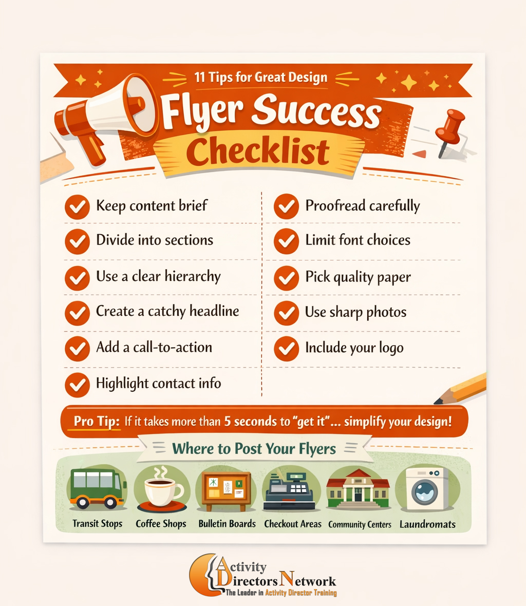
Use this section as your “at-a-glance” flyer standard — clear, repeatable, and easy to teach to a team.
- Keep your content brief: include only essentials; don’t overwhelm the reader.
- Divide copy into digestible sections: use headings and short blocks to reduce “reading time.”
- Use a clear hierarchy: headline first, then key details (date/time/location), then supporting info.
- Create a captivating headline: your first line should hook attention fast.
- Add a call-to-action: tell readers exactly what you want them to do (Call, RSVP, Join, Sign up).
- Highlight directions & contact information: make it easy to find and visually bold.
|
- Proofread: errors reduce credibility; ask someone else to review it too.
- Limit font choices: use 2–3 fonts max; keep readability strong from a distance.
- Choose the right paper stock: flyers get handled a lot — quality matters.
- Use high-resolution photos: low-res images look unprofessional and print poorly.
- Incorporate your logo: branding increases recognition and credibility.
|
Pro Tip: If someone can’t understand the basics in 3–5 seconds, simplify your layout and tighten your hierarchy.
Distribution: Where to Post Flyers
Start with two questions:
Where do people frequently go and stand idle?
Where does your target audience spend time?
- Transportation hubs: rental car, subway, bus stops, ride pickup areas
- Local coffee shops: a flyer + a waiting moment is a perfect match
- School bulletin boards: with permission, post in gathering areas
- Checkout counters & reception areas: anywhere people wait at a counter
- Community boards: Chamber of Commerce, town hall, grocery stores, libraries
- Laundromats: people waiting often read — make it easy for them
Show off your creativity and get the word out about your event in a flyer!
Want More Ready-to-Use Resources Like This?
The Activity Calendar Club delivers monthly activity calendars,
newsletter templates, planning tools, and practical resources —
all designed to save time, support compliance, and make your job easier.
Join the Calendar Club
PDF & Word formats • Ready-to-print • New content added regularly


